What I really like about this picture is that her hair is really red when you see her and in the hair looks dark which brings out her eyes
I would take her in the light so that her hairs stands out more.
to focus on her face more, that getting her upper body.
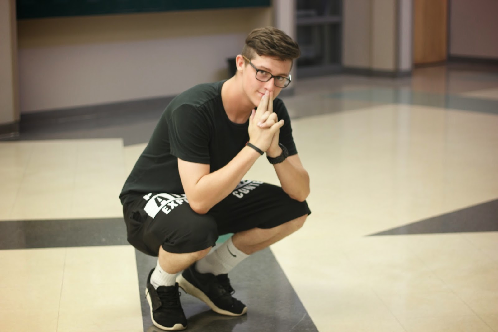
What i like about this image is that it focuses on the the subject more and the patterns on the floor are blurred out.
i would try to have a different back ground so you can focus on the subject more
Learn to chose a better background
What i like about this image is that the colors combine well with each other .
Try to know get the extras in the back ground as much
i could cut out the building
I like how i got this picture off guard
i could of came down a little bit just to cut off the window in the back ground
i learned pictures off guard come out better
what I like about this picture is that you can tell that she is focused into what she is doing
I couldn't of came at a higher angle to see what she is doing and still get her face in the image.
I could of focused it a little more.
i like this picture because well she is my sister and she look very beautiful!
what i could of done different was get the rest of her head.
capture the whole subject.
what iw like about this picture is that i tried it at a different angle and how the back is blurred and just focused on the face.
i could have focused it more.
make sure it is clear.


No comments:
Post a Comment